This is an explanation of the Provider Network Analyses that the Colorado Foundation for Medical Care Analytic Services team created for the communities participating in the Using Data to Drive Improvement/Supporting Data and Communities Special Innovation Project.
As used on this web site, Provider Network Analysis (PNA) characterizes relationships among healthcare service providers in a network and enables the user to visualize the network as a diagram of interconnected nodes. PNA is a specialized example of a more general methodology called Social Network Analysis (SNA), and you may find that term used in some documentation on this web site when discussing PNA. Applied to the parties-to-transition table (PTT) from the Integrating Care for Populations and Communities Aim, PNA can inform intervention strategies by identifying the sender-receiver relationships that account for a large proportion of the community’s transitions.
Care transitions network diagrams depict the flow of transitions among providers in the community. Providers are shown as colored nodes, with a unique color for each provider type (e.g., Hospital, SNF, HHA). Transitions between providers are represented by an arrow connecting the two nodes. Unidirectional ties – where transitions flow only from sender to receiver – are depicted as black, single-headed arrows. Bidirectional ties – where transitions flow in both directions between providers – are depicted as red, double-headed arrows. The size and weight of the arrow indicate the tie’s relative strength: thicker arrows represent more transitions, and larger arrowheads represent higher flow in the direction indicated. The relative distance between providers is not intended to depict any specific aspect of their relationship. The position of the provider nodes is not based on geography. Node placement is determined by the “closeness” of providers measured by their frequency of interaction with one another.
Provider Network Analysis Example
Presented below is one product of PNA: the network diagram. This example is based on the Monroe, Louisiana, Hospital Referral Region Provider Network Analysis.
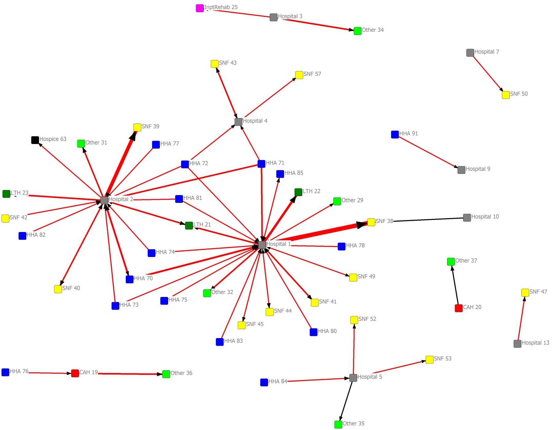
Monroe, Louisiana Hospital Referral Region Provider Network Analysis
The visual conventions used in the diagrams are presented in the picture below.
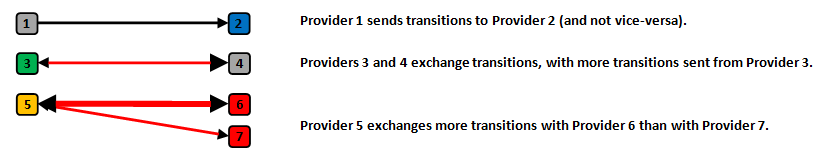
Coding of Provider Network Analysis
The diagrams were derived from the PTT for the community of interest, depicting fee-for-service Medicare Part A (non-outpatient) claims during the calendar year 2011. Each diagram is filtered by a threshold number of transitions shared.
Filtering of ties by number of transitions may result in red, single-headed arrows, which indicates the threshold number of transitions being met only in the direction of the arrowhead. When the threshold of shared transitions is met in total, but not in either single direction, the tie will be red with no arrowheads.
Some things to look for
- Thick, red arrows (especially if one node is a hospital; high back-and-forth flow suggests high readmissions associated with the downstream provider)
- Hub and spoke patterns (often a hospital and its prominent downstream providers)
- Several arrows pointing to a single node (leverage point for receiver intervention)
- To enable sharing of the network diagrams among community stakeholders, provider identifiers have been replaced with an alias referencing provider type (e.g., “Hospital 1”). For Medicare provider numbers (hsp_id), the analyst should refer to the community’s provider identifier list. Moreover, the actual numbers of transitions shared among providers during this time period, which determines the thickness of the arrow, may also be useful.
Provider Network Analysis Filtering Example
Provider Network Analysis diagrams can be very confusing if many relationships are shown at once. To make major parts of the network more clear, simpler versions of the diagrams can be shown. By increasing the number of interactions required to show a relationship, the number of qualifying relationships will be reduced. This produces diagrams that show fewer connections.
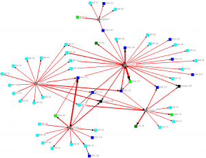
Here is an example of a very complex diagram that conveys little information:
All providers for Cincinnati (CY 2011). Connections indicate one or more transitions shared.
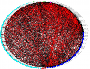
All providers for Cincinnati (CY 2011). Connections indicate one or more transitions shared.
In the next diagram we only show connections with 10 or more interactions:
Providers connected by a minimum of 10 transitions (CY 2011)
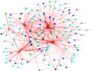
Providers connected by a minimum of 10 transitions (CY 2011)
In the next diagram we only show connections with 30 or more interactions:
Providers connected by a minimum of 30 transitions (CY 2011)
Providers connected by a minimum of 30 transitions (CY 2011)
In the next diagram we only show connections with 100 or more interactions:
Providers connected by a minimum of 100 transitions (CY 2011)
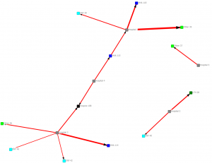
Providers connected by a minimum of 10 transitions (CY 2011)
Source material
Introduction to Social Network Methods (Hanneman & Riddle, 2005; This is an explanation of the Provider Network Analyses that the Colorado Foundation for Medical Care Analytic Services team created for the communities participating in the Using Data to Drive Improvement/Supporting Data and Communities Special Innovation Project.http://faculty.ucr.edu/~hanneman/nettext/)
UCINET documentation (Borgatti, Everett & Freeman, 2002; http://www.analytictech.com/ucinet/)
Acknowledgements: Qualis Health, Colorado Foundation for Medical Care