
By Joanne Lynn M.D.
[Also see companion post by Stephen F. Jencks, M.D., M.P.H.]
Care transitions improvement programs have been effective in helping the health care system both become more effective in serving people living with serious chronic conditions and reduce costs. However, the key metric used to measure performance is seriously malfunctioning in at least some hospitals and communities, leading to penalties and adverse publicity for providers and communities that are actually performing well and continuing to improve performance. In this post we provide supporting data, and a companion blog article provides a thoughtful discussion of the conceptual issues underlying this troubling malfunction. For our earlier blog post about this problem see: http://medicaring.org/2014/08/26/malfunctioning-metrics/.
Very simply, this problem arises because the metric used is some variant of readmissions (within 30 days) divided by discharges (from a particular hospital) within a particular period. Thus, the usual metric is something like “20% of Medicare fee-for-service (FFS) hospitalizations are followed by a readmission within 30 days.” This metric works well if the denominator, namely the number of hospitalizations, is not affected by the improvements that reduce the risk of readmission. If the denominator declines along with the numerator, the metric will not reflect the degree of improvement that was actually achieved. The data below show that this happens in real situations.
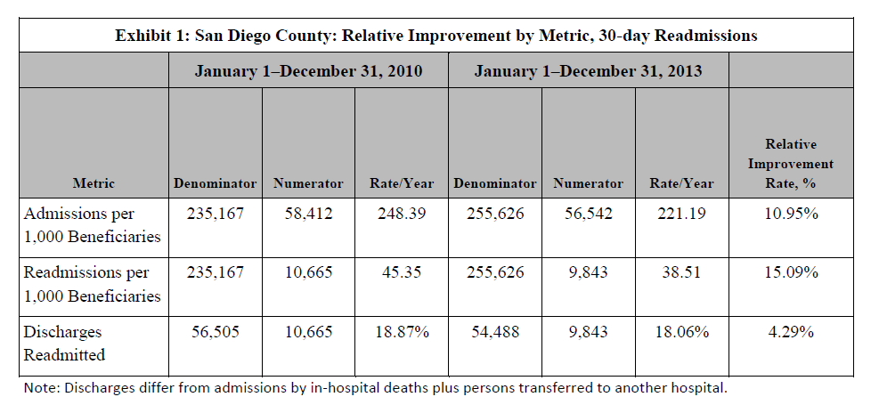
We are here showing the data from San Diego County, a very large county with about 250,000 Medicare FFS beneficiaries, who had about 60,000 Medicare FFS admissions to hospitals per year and about 10,000 readmissions per year in 2010, when almost all of the hospitals and the county’s Aging & Independence Services (functioning as the Community-based Care Transitions Program partner agency/Area Agency on Aging/Aging and Disability Resource Center) started working together to improve care transitions and reduce readmissions under the San Diego Care Transitions Program, one of the Community-based Care Transitions Programs initiated by Section 3026 of the Patient Protection and Affordable Care Act. The application year was 2012 and the start-up year was 2013. The table below shows an initial summary of their results, provided through their Quality Improvement Organization.
Readmissions of county Medicare FFS residents fell by 15% in 2013, compared with 2010. San Diego County reduced hospitalizations by 11%. However, when the numerator and denominator go down at nearly the same rate, the fraction moves just 4.3%, which falls far short of the 20% reduction goal that Medicare has set.
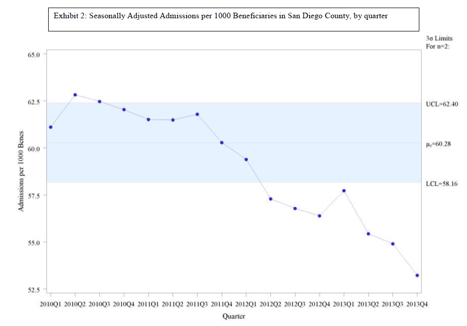
What follows are the quarterly data from San Diego. The first graph, Exhibit 2, shows the quarterly rate of admissions per 1,000 Medicare FFS beneficiaries in San Diego County. We have adjusted these data for the effects of seasons on admissions (since there are usually more admissions in the winter). The shaded portion shows the “control limits,” an area which represents the expected range of variation demonstrated in the first 3 years of the data (2010-2012). Data that fall outside of the range or that consistently run on one side of the midline indicate that something has changed in how the system is functioning. Clearly, admissions are falling.
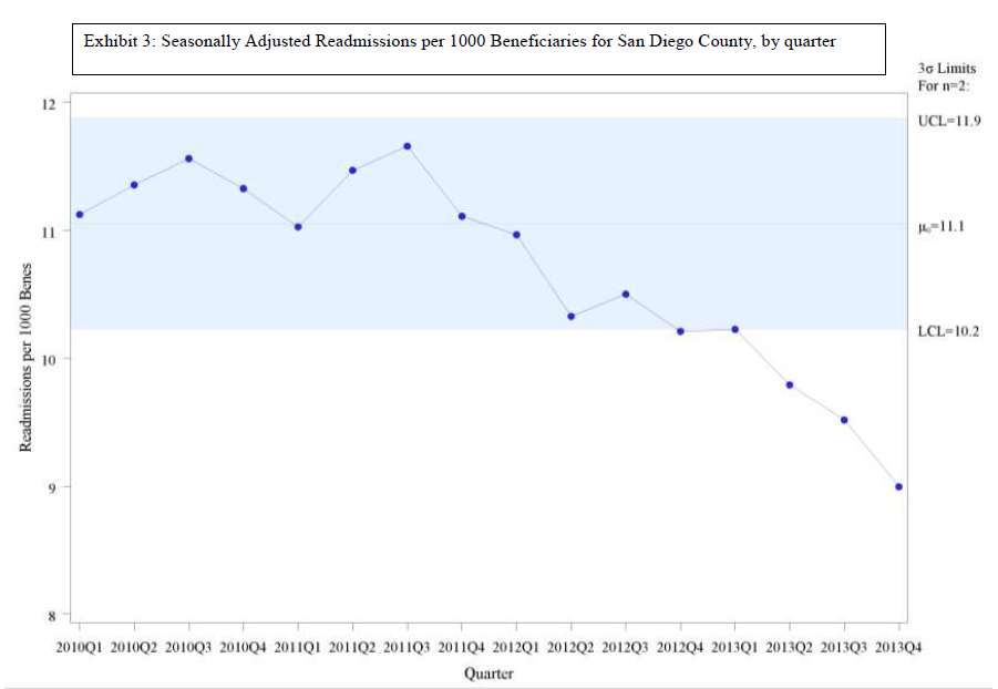
The second graph, Exhibit 3, shows the readmissions rate in the same framework – quarterly rate of readmissions per 1,000 Medicare FFS beneficiaries in San Diego County, adjusted for seasonality. The control limits again show change. Readmissions are falling.
The third graph, Exhibit 4, shows the metric in the conventional form, readmissions divided by discharges. The graph does eventually show a decline, but only a modest one. The fact that the denominator was falling attenuated the impact of the falling number of readmissions.
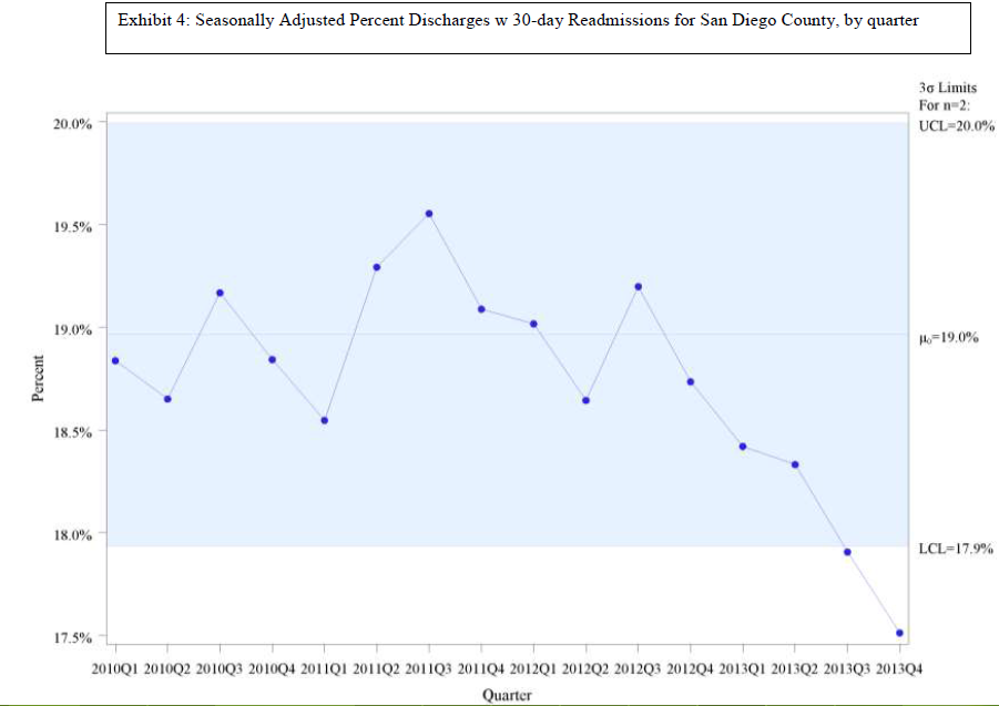
Exhibit 4: Seasonally Adjusted Percent Discharges with 30-day Readmissions for San Diego County, by quarter
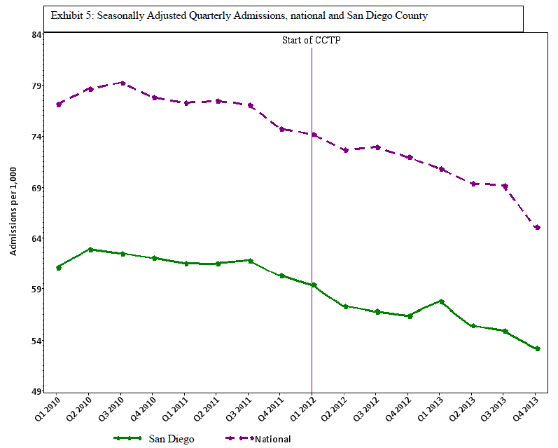
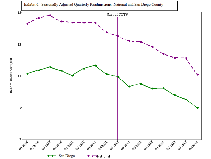
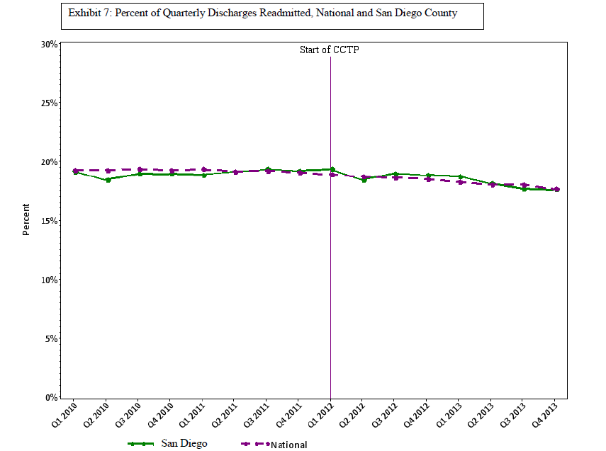
The next three exhibits show the comparison of the San Diego measures with the national rates for the same metrics. Exhibit 5 shows that San Diego County is dramatically less likely to have Medicare FFS beneficiaries in the hospital than the nation as a whole: 56 per 1,000 per quarter in San Diego, compared with 69 per 1,000 per quarter nationwide. Exhibit 6 shows that San Diego is also much lower in readmissions than the national average: 10 per 1,000 per quarter in San Diego, compared with 12 per 1,000 per quarter nationwide. In both cases, the declining use is reasonably parallel between San Diego and the nation. This would imply that improvement strategies are still being effective at this lower range, and thus the lower range is not yet a limit on improvement opportunities. Exhibit 7 shows that San Diego County’s conventional metric of readmissions divided by discharges simply tracks the national average. Clearly, the metric is not functioning in a way that reliably separates good practices from wasteful ones. That readmissions over discharges metric does not convey the fact that San Diego is much less likely to hospitalize and to rehospitalize. Indeed, 10 of the 14 San Diego hospitals eligible for penalties for high readmission rates are being penalized next year. Since the calculations that go into determining the hospital penalty focus on particular diagnoses in three past years, it is possible that these hospitals manage to do badly with those diagnoses in those years, but it seems quite unlikely. More plausibly, the metric used is of the readmission divided by discharge form, so the shrinking denominator will affect this calculation.
Without access to and analysis of much more data, one cannot know how widespread this problem is. We do know that San Francisco had an admission rate of just 50 per 1,000 per quarter in 2013 and a readmission rate of just 8 per 1,000 per quarter, which are rates much lower than San Diego. Yet 8 of San Francisco’s 10 eligible hospitals will be penalized for excessive readmissions in 2015. Furthermore, we know that the initial Medicare foray into this work, published in the Journal of the American Medical Association in January 2013 (link: http://jama.jamanetwork.com/article.aspx?articleid=1558278&resultClick=3 “Association Between Quality Improvement for Care Transitions in Communities and Rehospitalizations Among Medicare Beneficiaries”, see “Outcome Measures”), involved 14 smaller communities, and that project had to change from using the discharge-based metric to using the population-based metric when it became clear that the shrinking denominator was making the project monitoring unreliable.
Hospitals, other providers, and communities that believe they may be adversely affected by the malfunctioning metrics should have access to the data needed to investigate and CMS should welcome reconsideration of those situations. NQF should suspend endorsement of new readmission/discharge metrics and re-examing existing ones. CMS has multiple contractors working on readmissions, and some have substantial experience and skills in the technical details of these metrics. CMS should quickly modify their contracts to require them to investigate the extent of this problem, to identify steps to ameliorate adverse impacts of the current readmissions/discharges metrics, and to build the metrics that can guide care transitions work into the future. Certainly, the time has come to sort this out and develop metrics that reliably separate exemplary from persistently inefficient practices.
Want to know more?
“Protecting Hospitals that Improve Population Health” by Stephen F. Jencks.
http://medicaring.org/2014/12/16/protecting-hospitals/
“Senior Alert: A Swedish National Dashboard for Preventitive Care for the Elderly” by Elizabeth Rolf.
http://medicaring.org/2014/12/22/senior-alert/

Your excellent research is really demonstrating not only a current problem within Medicare policy but an historical problem with CMS and Medicare policy that tends to penalize conscientious health care providers that are trying to do the right thing and provide quality care. A similar situation arose via the Balanced Budget Act changes to home health reimbursements via the Interim Payment System whereby efficient home health agencies were penalized (indirectly) for being conservative in controlling their costs prior to the BBA. Unfortunately, history seems to repeat itself, and Medicare policy is again focused more on simply cutting costs, rather than making long-term changes in the system that will truly improve quality while controlling cost. Perhaps a class action law suit is the only way to “encourage” CMS to revise the equation.
This analysis identifies a potential problem with the ratio of rehospitalization/hospitalization over time if the population being admitted isn’t stable. There is the same problem with comparing different hospitals, which may have different distributions of types of patients with varying risk of rehospitalization. The math of the analysis is not clear, however. If you roll a die twice, what are the odds that the same number will come up two times in a row? It is 1/6 regardless of the number of times you roll play this game. If each hospitalization is an independent event, then changing the total number of hospitalizations does change the risk (or rate) of rehospitalization.
This analysis suggests that the reduction in hospitlalizations (denominator) might have occurred disproportionately in low risk patients (e.g. elective procedures in health elderly). If heart failure management has improved, then the reduction in all CHF admissions would likely reduce rates rehospitalizations, since this is a high risk dx.
Strategies designed to reduce rehospitalization are unlikely to affect low risk admissions.
The solution, as with many other programs such as Medicare Advantage reimubursement and Home Care Compare, would be to better adjust for case mix of all hospitalizations across hospitals and across time before public reporting and imposing sanctions.
Excellent article! San Diego has also had a number of very robust geriatric medical programs for the last twenty five years, which is probably one of the reasons for their low admission rate compared to national numbers. What appears to be happening is that early adopters of improved health care delivery strategies are being penalized. This has happened with a number of the Pioneer ACO’s, who, despite excellent numbers compared to national data, are being penalized for lack of “improvement”. Something definitely needs to be done about this. In fact, the answer is probably not that complex. It should be easy to identify those who are already outperforming national averages and set different goals for those providers. Of course, that just makes too much sense for CMS to implement:)